Data Table Widget
A Data Table Widget builds UI for a Data Table using a row prefab for each row in the table.
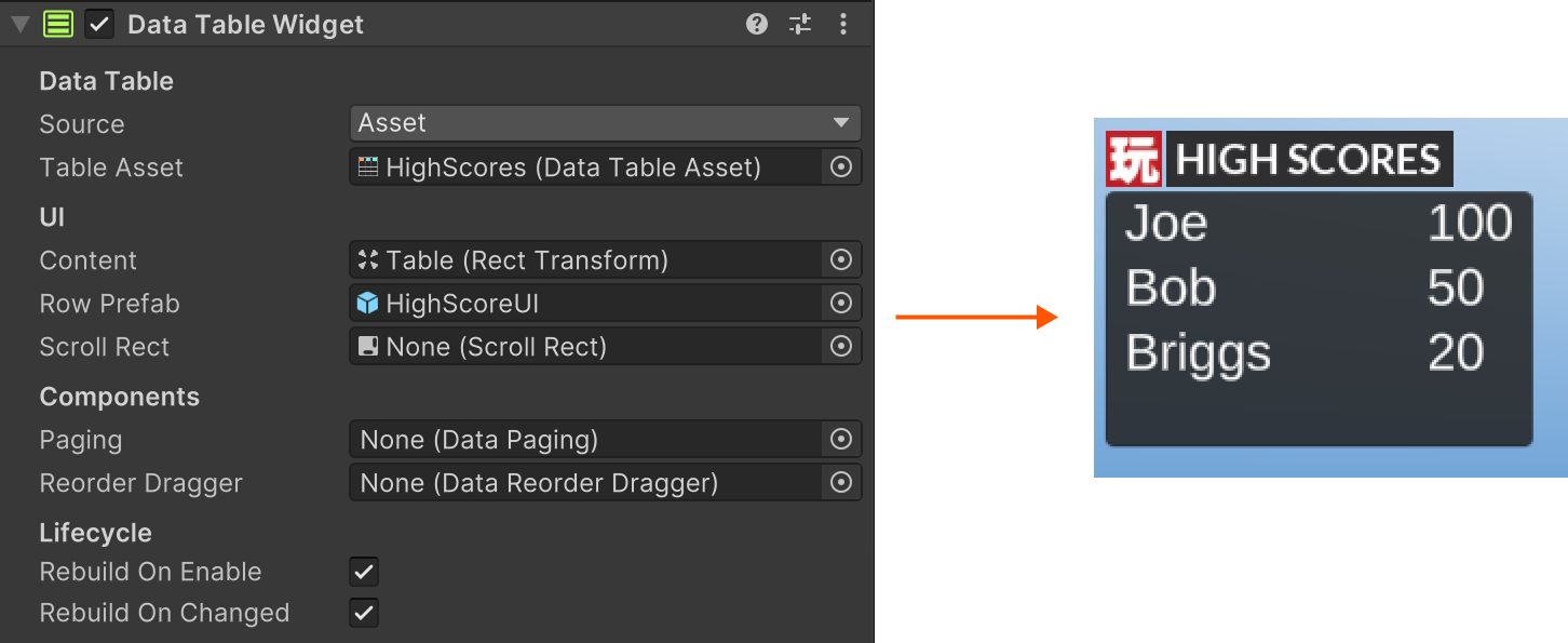
Use it for scoreboards, inventories, quest logs, player lists, etc.
Setup
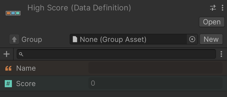
Create a Data Definition with your fields:
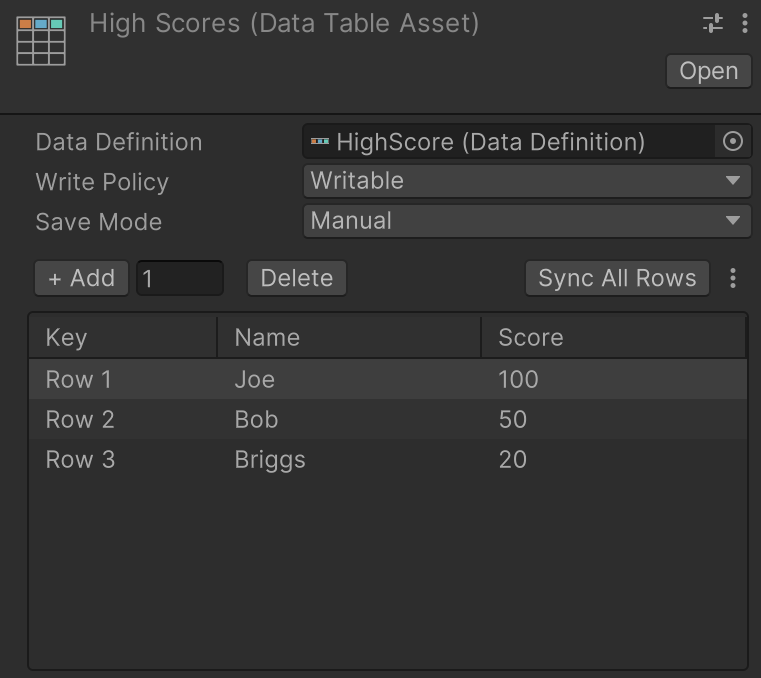
Create a Data Table that uses that definition:
Add a Canvas to your scene for your UI:
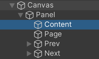
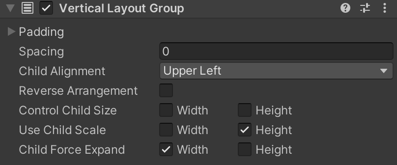
The content root should have a Layout Group:
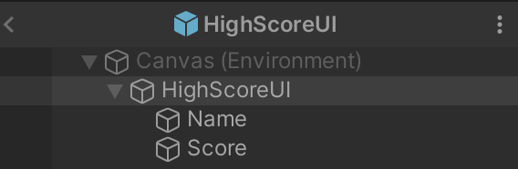
Build a row prefab:
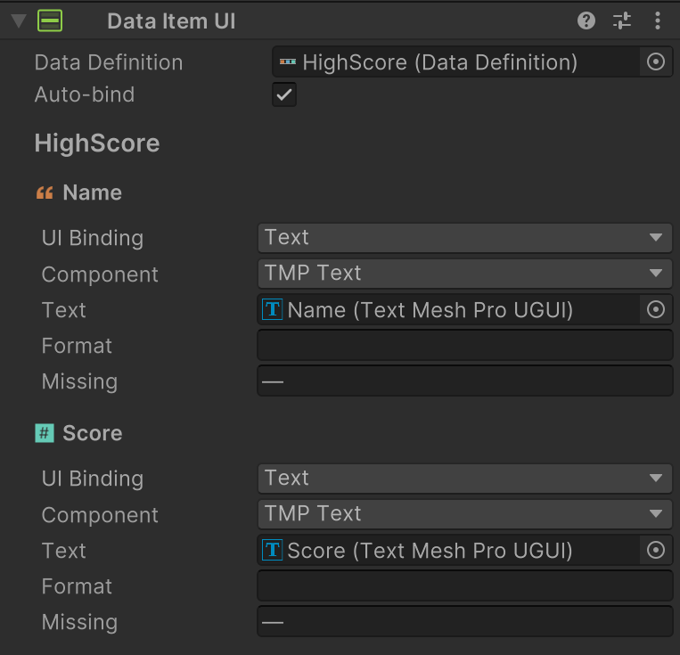
Add a Data Item UI component to bind fields to UI components:
Add a DataTableWidget to the scene (commonly on the canvas):
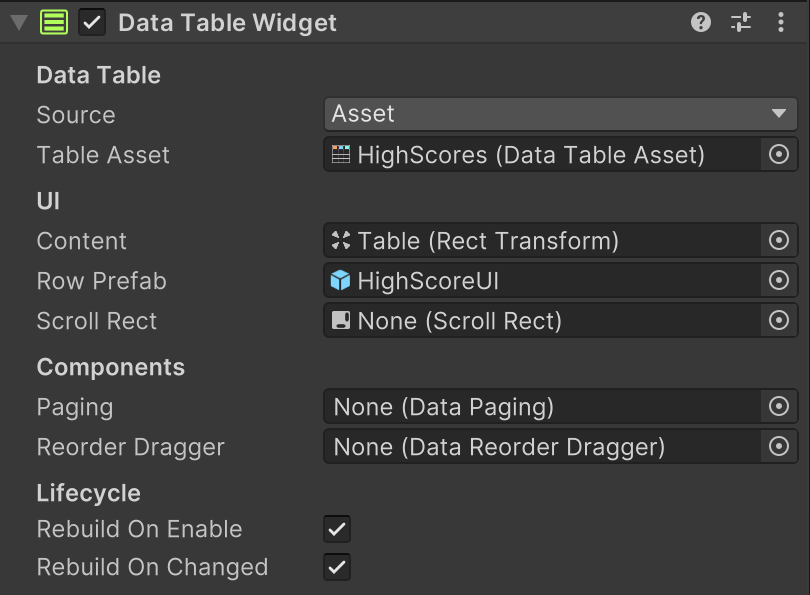
The widget references all the elements, tying them together:
- Table: The DataTable asset or component to use.
- Content: The UI root to add rows to. Should use a layout group.
- Row Prefab: The row prefab used to build each row in the table.
Data Item UI
The row prefab should use Data Item UI to connect data definition fields to UI elements.
It can also contain components that send commands to the DataTableWidget:
- Data Item Button Action: Place on buttons in the prefab.
- Data Item Drag Action: Place on a drag handle in the prefab.
- Data Item Selection: Place on a highlight object in the prefab.
- Data Item Select On Navigation: Select row when EventSystem focus enters row.
- Data Item Move On Navigation: Move rows from Up/Down navigation input.
Common commands include Select, ToggleSelect, Delete, MoveUp, MoveDown, and drag lifecycle commands when reorder is enabled.
The DataTableWidget handles these commands and updates the source table automatically.
Navigation
DataTableWidget integrates with Unity Selectable navigation for row-to-row movement and edge behavior.
- Row links are configured automatically for visible rows.
- At the table edges, behavior follows
Row Navigation Mode:Default,Lock To Table, orWrap. Navigation Action Modecontrols whether navigation input does focus only, row select, or row move behavior.
For complete setup details, see Data Table Navigation.
Components Used
A full setup commonly uses:
- DataTableWidget: builds visible rows from a Data Table
- Data Item UI: binds one row's fields to UI controls.
- Data Table Navigation (optional): configures keyboard/gamepad row navigation behavior.
- Data Item Select On Navigation (optional): maps row focus to row selection.
- Data Item Move On Navigation (optional): maps row Up/Down navigation to row move commands.
- Data Item Button Action (optional): sends row commands from UI buttons.
- Data Item Drag Action (optional): sends drag commands from row drag handles.
- Data Item Selection (optional): displays selected state visuals.
- Data Paging (optional): page controls and page info UI.
- Data Reorder Dragger (optional): drag-and-drop row reordering.
Actions
Use these actions to work with DataTableWidgets in FSMs: