Filled Image Meter
A Filled Image Meter displays a value using a filled UI Image (fillAmount).
This is ideal for:
- Health Bars
- Mana / Stamina Bars
- Progress Bars
- Loading Indicators
- Any continuous 0-1 style meter
Widget setup:
- Add and configure a Filled Image Meter component.
- Update the meter with a Filled Image Meter Update action.
- Optionally set range and value together with Filled Image Meter Set Values.
Filled Image Meter Component
Add Component -> PlayMaker -> Widgets -> Filled Image Meter
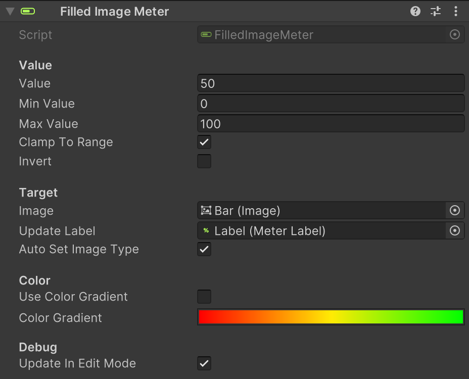
Parameters
| Field | Description |
|---|---|
| Value | Current numeric value. In edit mode, this previews the filled amount. |
| Min Value | Value corresponding to an empty meter (fillAmount = 0). |
| Max Value | Value corresponding to a full meter (fillAmount = 1). |
| Clamp To Range | Keeps values within Min/Max before normalizing. |
| Invert | Reverses the fill direction (1 - t). |
| Image | The Image to update. Image.type should be Filled. |
| Auto Set Image Type | Automatically sets Image.type = Filled in edit mode. |
| Update Label | An optional Meter Label to update when the meter changeds. |
| Use Color Gradient | If enabled, the image color is driven by a gradient. |
| Color Gradient | Gradient evaluated from 0 -> 1 (min -> max). |
| Update In Edit Mode | When enabled, the meter updates automatically in the editor for previewing. |
Notes:
- Values outside Min/Max are clamped when Clamp To Range is enabled.
Actions
Filled Image Meter uses these actions:
Tips
- Configure Min/Max to match the source value range (e.g., 0-100 health).
- Enable Use Color Gradient for dynamic color transitions (green -> yellow -> red).
- Use Invert for reverse-style meters (e.g., countdown timers).
- Enable Update In Edit Mode to preview layout while adjusting UI.